Friday, May 13, 2016

A Reign of Hope


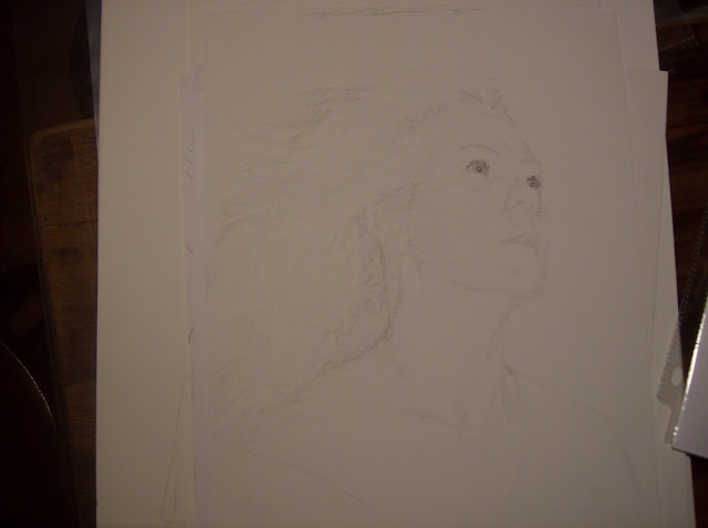
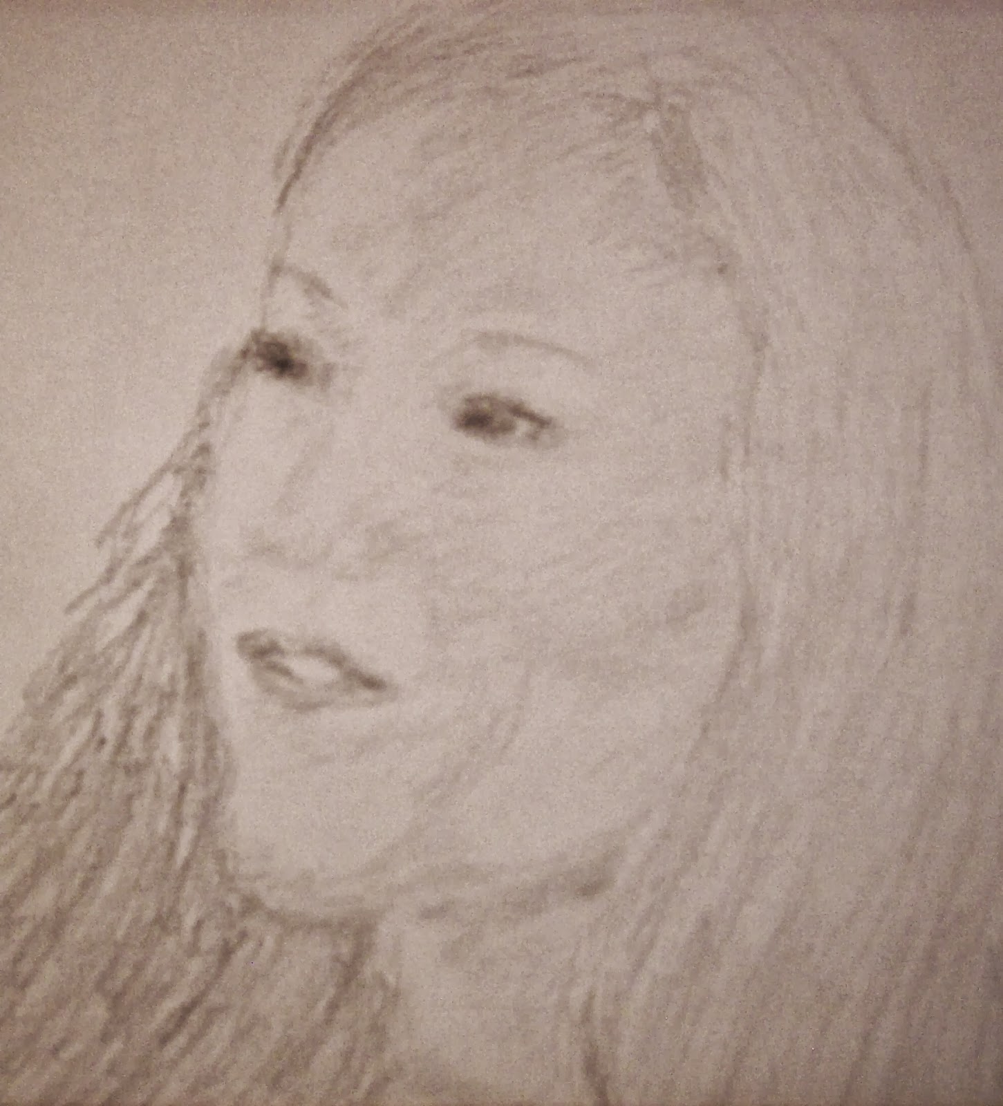
This photo is called Phantom Queen and has been the inspiration for more than one piece of artwork.

She has kind of been nagging me of late so chances are there will be a few more pieces to add to the Queen Collection.

As soon as I get at least Part One of HELL AND HIGH WATER published I plan to take a break from writing and get some art done.

That, my friend, is going to happen ASAP. Part One is just about ready to go - a final edit and I can get it into print.

As for the Queen artwork ... the colors aren't going to let me go. I've got to invest in massive quantities of cobalt blue and metallic gold.

I've got a big square canvas staring me in the face. 


I've got it reversed, an experiment to see how it works to do my 'sculpted', high textured paintings within the protection offered by the framing of the stretched canvas. My thought is that I can then add glass to the framing without damaging the painting.

It's worth an experiment.

At any rate, a couple of things are in my head at the moment, both of them based on the above photo.

One is to do aspen leaves in gold over a cobalt background, of various sizes scattered all over the place.

The other is to use the texturing and see what I can come up with in terms of an interpretive piece of the Queen.

We shall see what we shall see.

My first step is going to be to get the back (actually the front, but in this case it's going to be the back) of the canvas coated with stabilizing paint - several coats I'm thinking, of plain white. Then a top coat or two of that liquid rubber I have for my boots. It dries to a blue color that I'm hoping won't clash with the cobalt. It will be on the back and won't really matter, but it's the principle of the thing.

And my gut tells me to do the Queen painting first so that's probably what I'll do.

I can get the photo into my projector and use it for a guide. Because the 'experiment' my sister talked me into trying fell flat on its face, I'm going back to using plaster. It will mean working very fast and not having any wiggle room for 'fixing' but will be worth it.

The texturing means I'll have the bulk of the painting done in white on white (plaster over white paint with another coat - or two - of white paint over the top of the plaster to help protect it). Once that's done all I have to do is put the colors on.

I'm only going to do the central stand ... the trees off to the sides aren't going to be there - I think. To get the square instead of the photo's rectangle I'll just carry the sky and ground out to the sides leaving the Queen centered.

Yep.

That ought to do it.

Because it's an interp piece I don't have to follow any rules.

The cobalt can go straight down to the bottom of the frame if I want and I can just leave the ground totally out of the picture if I want. White and black for the trunks, gold for the leaves. The texturing will make the 'front' leaves pop but I can still use shading and highlighting to emphasize the depth.

So that's what's on my agenda.

What the Queen will actually decide she wants remains to be seen. For all I know she'll just opt for gold highlights over cobalt including the trunks.

Yep.

Gotta get this Story done I surely do.


Monday, June 22, 2015

Dunnottar getting close to being cover ready


Yeah it's a little hazy there - I was going to re-shoot the photo, then looked again and realize I kind of like the look ... go figure. I will have to do the finishing touches on this piece and get another photo of the final thing, but this will do to go on until then.

The portraits of the Younglings of Dunnottar are also works in progress ... rough pencil sketches with colors added, similar to this process - pencil, seal, tint, seal, pencil, seal, tint, seal ... ad nauseum, ad infinitum LOL !!! Not really; it just seems that way!

Most of the portraits have their first tints; everything is experimental, learning as I go along here ... Merri, for example is going to get her mother Alianora's hair instead of the straight hair the sketch shows, just because; Diann's tinting needs toning down and touching up - her hair's too bright; Dothann's is going to need its hair fixed; Corrbed, however, may well be finished as is - I'm afraid to touch it for fear of messing it up ... Brann and Rua are still pencil sketches. So all you get to see here with any color is Corrbed - the others might shoot me if I put them up before they're ready to go. When they are ready, the current plan is for them to go onto the cover photo with Dunnottar centered among them. 

Here are the pencil sketches of the Younglings:

My Lord! Look at the eyes on that boy! Not his natural color here - those are even more stunning.


These are my current works in progress, and joy it is to work on them!

Tuesday, May 26, 2015

Experimenting for the Youngling Cover

Yeah, I know ... 

'Really, Shiela? Experimenting NOW? On a COVER? AGAIN?!'

Um ...

This time I'm conducting my experiment in an orderly fashion, I'll have you know.

*laughing*

I've got the horses and ponies sketched onto the 4x6 foot painting fabric, and instead of trying to remember what worked and how I did the ones for Perth and Tarnos, I've decided to not experiment directly with the big one.

So I've got myself a dish towel stretched onto my window frame easel (ironed this time, believe it or not) and am going to sketch the basic outlines onto that and go with the paint. 

This might take a while.

Here's a photo of the blank 'canvas' for you to gaze at while I go sketch.


# time gap

Okay, this is how I do some of the paintings. My own 'style' being more on the abstract or impressionistic side, when I want the conformation and such to be more 'accurate' I cheat. Pulling up the photo I want to enlarge on my computer screen, I hook the computer up to my handy dandy projector.


I can make the image any size I want, from big enough to fill the 4x6 foot painting 'frame' that I like, to small, to in between like the following photo. This is the image projected onto the fabric stapled to the window screen easel (three window screens hinged together, but I'm only using the top of one of the screens for this). Whatever's on my computer screen is what shows up.


I've had to do things the hard way for so long that I automatically take that route first, no matter what. I know that trying to draw on low thread count fabric is not going to work well. I always try it anyhow.


Then I try to make it easier by trying to seal it, this time with a spray sealant.


While I was waiting for the sealant to dry, it dawned on me that I've got part of a roll of actual canvas, so out I rolled it in my sewing room and cut a hunk to fit the screen easel.


Having neither the time nor the patience to get the heavier canvas 'stretched' onto the screen easel, which isn't exactly designed for any such thing, I looked around for another alternative. In front of my eyes sat a stack of pre-stretched canvases. These are the ones I use for pencil sketches of actual people, but really ... there's no law that I know of that says I can't sketch book covers on them. 

And so I did. 

Hung one on the pegs I put onto one of the screens for exactly that purpose, adjusted the projected image, and it took a whole ten minutes or so to get the horses and ponies sketched in.


Not only can I sketch more easily on the pre-stretched canvas, I can paint on it, too.

That means this experiment can continue with the dawn's early light as I try to figure out how to get Merri's Percheron a fiery red chestnut, Diann's Arabian white, Corrbed's Arabian black, Dothann's Welsh Pony a sort of bay, Brann's Welsh a gold palomino, and Rua's Shetland dapple grey. 

I have a plan, really I do. It's an experimental plan, but it MIGHT work!

Mm-hmmm.

I see those heads shaking and those brows raising.

Oh ye of little faith!

What is life but an adventure?

Yup.

And this one is only just beginning.

What I would like to know is how on God's green earth I'm going to get any details at all onto the faces of the Younglings who are destined to ride these steeds. They'll be about the size of a quarter ... thank goodness I have a very good pencil sharpener.

Ah well, I'll fret about it tomorrow.

'After all, tomorrow is another day.'

If I'm to be up by dawn's early light, I'd best find some rest.

*laughing*

I just thought to check the 'sealed' fabric - it actually seems to have maybe done some good, so I can use that one to test the colors on!

By the time I'm done experimenting this book cover is going to have half a dozen preliminary experimental versions!


Thursday, April 23, 2015

Artwork In My Front Porch Windows

I live on Main Street of Small Town USA, just in case anyone was wondering how it is that so many people happen to drive by my house on a regular basis.

At different times I've hung artwork in my front porch windows, and get plenty of nice feedback about it. There are fourteen windows out there, four on each side of the front door and three each on the ends. Plenty of room for artwork!

Just recently I've hung the big drafts of the book cover paintings, to keep them unfolded and out of my way, and because I like seeing them.

A lady stopped by the shop where I was working the other day and told me that she had seen the Characters (of Mamm of Perth) in my front porch! It took me a minute to realize that she hadn't been hallucinating but was referring to the painting hanging there. Made me smile.

As this my artwork blog, perhaps it would be a good place to put the process of getting that painting done.

1.  Right off the bat I used a full sized bed sheet vertically, projected the images I wanted to use for patterns onto it, and sketched them in. I needed more horizontal space and the images weren't exactly what I wanted so I scrapped this one and started over.


2.  Here's the paper mock-up I decided on after a lot of image printing and making many and many 'paper dolls' to play with and rearrange. I also took lots of photos of the faces of my volunteer 'Character Reps'.


3.  This is the yew tree I chose after looking at photos of hundreds of them. I wanted the family to look like they were striding right out from the tree.


4.  Here and below are a trial I did. I wanted to back paint the background for the painting, and needed to know what to expect, whether the back painting would bleed through the images I blocked out on the front, or what. It looked like it might work, so I got to blocking the figures onto the front of the painting. This time I went with marking out a section four by six feet so as to have a painting that would translate well to the four by six inch size called for by the book cover design.

xxx


5.  Blocking in the figures just means painting them as silhouettes on the face of the painting so the back painting wouldn't come through and I'd have the solid color to paint on rather than having to fight with trying to paint one design over the distraction of the one already there. Above is the face of the painting; below is the reverse showing through using a backlight.


xxx


6.  Once the blocking was done I projected the image of the tree onto the face of the painting, checking to see how it might look, getting it to fit ... then I penciled it in.


7.  Above is the Yew sketched in with the figures, front view. Below is the reverse side of the painting with a backlight. I went ahead and used a marker to make the lines stronger. Paint trumps marker.


xxx


8.  Next came blocking out Ullin's form and putting a defined outline in place with paint. Below you can see the result lit from the reverse side of the painting, the side the Yew gets painted onto.
 

xxx


9.  This is the front of the painting. I added just a bit of water to the acrylics I used for the Yew, wanting to be sure it would saturate through to the front of the fabric - which it did beautifully, with the blocking holding its place nicely. Below is Ullin's face surrounded by the Yew foliage. That's a shadow on the painting; he isn't actually part grey. I added touches of foliage here and there on the front side to increase the illusion of him being in or a part of the tree.


xxx


10.  And so the painting of the figures begins ... 


xxx


xxx


11.  Once I got a halfway decent photo of the painting I took it into one of the programs I use to fiddle with photos and gave it a solid blue background. If you've got a copy of Mamm of Perth with this solid blue background, it's one of the first ones out of the chute.


Here's the final cover. Changed the background to one of my own photos and added the Circles of Dunnottar.


Wednesday, October 16, 2013

Portraits From Photos


Most of the below are either rough pencil sketches or experimental ... just so you know ... only the first two shown here, and the last one, are actually anywhere near 'finished'.  

This is my mom, from a photo she gave me of when she was younger.  It's pencil on canvas with acrylic.

This is my daughter Sarah, using a photo that had her with a couple of other people.  Pencil on canvas, which turns out a lot better than other combinations I've tried ... 

This is me, from a photo I took to use as a character in a story.  Pencil on paper.

My daughter Helen, from a photo where her face was about the size of my thumbnail.  Pencil on paper.

This is from another of my mom's old photos that had only head and part of her torso - I added the rest of her and put her on a horse.  Pencil on paper.


This is Steve, my once-husband, from an old photo.  I took his shirt off, made his hair longer, changed the pants, and added the short sword.  Pencil on paper.


Here's my mom again, at least her face which is all that was in the photo - the rest is added for a character in that same story.  Pencil on paper.


Here she is again, the face from an old photo, a younger version of the story character.  Pencil on paper.


My daughter Heather, from a photo of her and other people - again, her face in the photo was about the size of my thumbnail.  Pencil on paper.  I'll take an eraser to it and lighten it up, but wanted all of this first.


My daughters Tess and Heather, from a group photo, but I added the mud and Heather's hair is not blonde.  Pencil on paper, then Prismacolor pencils.


My grand-daughter from a photo I took of her up a tree.  Pencil on paper with Prismacolor again.


Myself, again a sketch for possible use in that story.  Pencil on paper.


Ditto above.


My daughter Sarah from a blurry photo.


Sarah again.


Me again, for the story.


My mom, from a photo.  Pencil on acrylic-coated fabric.

Me again, for that same story.  It's my second try at people-drawing. Pencil on acrylic-coated fabric.


Very first experimental attempt at people-drawing, this is me again, for that story.  For this one I used a pencil sketch, pastels (face), and acrylics on acrylic-coated fabric.


Another of the very first attempts - the character refused to cooperate so his resemblance to my once-husband Steve is minimal.  Pencil on acrylic-coated fabric.


My son-in-law Casey from a photo I took some years ago.  This one is only a light pencil first sketch on acrylic-coated fabric..


My daughter Sarah again.  Pencil on acrylic-coated fabric.


Sarah once more, for use in the story.  It's the above pencil sketch finished with pastels.


I have scads of other sketches done from photos, but they're not of actual 'people' being almost entirely rendered from photos of ancient Greek/Roman statuary and put together in sketches for that story.